Explainable AI: SHAP for Explaining Credit Risk Decisions
Jun 24, 2025

"Your loan was denied." But what if you could open the black box and see exactly why?
As AI takes on more high-stakes decisions in areas like lending, hiring, healthcare, and criminal justice, the ability to explain a prediction becomes just as important as making it.
Over the past few weeks, I’ve been diving into the world of Explainable AI (XAI). This post is part of my journey: a hands-on experiment with SHAP (SHapley Additive Explanations) applied to a real-world credit scoring model, along with open-source code and a demo.
What is Explainable AI?
Explainable AI (XAI) refers to techniques that help us understand why a machine learning model made a specific decision.
Today’s best-performing models (XGBoost, neural nets, LLMs) are often black boxes. They work, but we can’t always trace how or why.
And that’s a problem — especially when AI is used to:
- Approve loans
- Select candidates
- Flag medical risk
- Make legal recommendations
We need transparency and accountability, not just accuracy. XAI helps answer:
“Why did the model make this prediction?”
Meet SHAP: A Tool That Makes ML Models Explainable
SHAP is one of the most trusted tools in the XAI toolkit.
It’s based on Shapley values from game theory and shows how much each feature contributed to a model’s prediction — either increasing or decreasing the score.
It works especially well with structured/tabular data and is:
- Model-agnostic
- Compatible with tree-based models (like XGBoost)
- Visual and intuitive
SHAP supports both:
- Global explanations – What does the model learn overall?
- Local explanations – Why did it predict this for a specific case?
The Project: Credit Risk Scoring
To explore SHAP, I trained a model using the German Credit Dataset — 1,000 loan applicants, 20 features like employment status, credit amount, and savings.
I used:
- XGBoost to predict if an applicant is a good or bad credit risk
- SHAP to interpret the model’s decisions
- Streamlit to build a dashboard you can interact with
Try It Yourself
You can check out both the code and the app:
- GitHub: SHAP Credit Risk Explainer
- Live demo: Streamlit App
To run locally:
-
Python script output:
- Trains the model
- Shows SHAP summary plot (global explanation)
- Shows SHAP waterfall plot (local explanation for one applicant)
-
Streamlit app:
- Lets you explore predictions for any applicant
- Displays local SHAP waterfall plots
- Shows input feature values
What the Model Is Predicting
The model predicts the likelihood that an applicant is a bad credit risk.
- Higher score = more likely to default
- Lower score = more likely to repay (i.e., good credit)
SHAP values show how each feature pushed the prediction up or down:
- ➡️ Positive SHAP = pushed prediction toward bad credit
- ⬅️ Negative SHAP = pulled it toward good credit
SHAP Summary Plot (Global View)
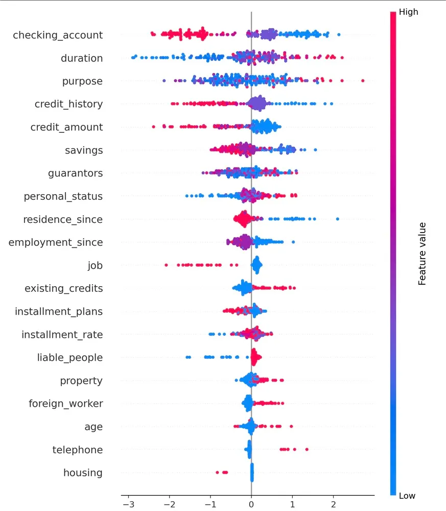
This plot shows:
- Which features matter most overall
- How their values (high or low) affect predictions
Each row is a feature. Each dot is one applicant. Red = high value, Blue = low value.
Example from my model:
checking_accountis the most important feature- High balances (red dots) appear on the left → reduced risk
- Low or no balances (blue dots) appear on the right → increased risk
It’s a bird’s-eye view of how your model thinks.
SHAP Waterfall Plot (Local Explanation)
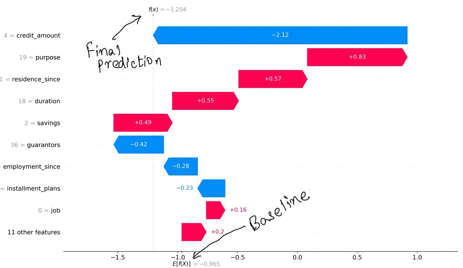
This plot breaks down a single prediction.
- Starts from a baseline score (average output across all applicants)
- Adds or subtracts the SHAP value of each feature
- Ends with the final prediction score
- Blue bars = features that reduce risk
- Red bars = features that increase risk
You can see exactly why the model made its decision for one applicant.
Final Thoughts
Explainability isn’t just a technical feature — it’s a trust feature.
Whether you're building credit models, hiring tools, or healthcare diagnostics, SHAP helps you open the black box and build systems that are not only accurate but also accountable.
#ExplainableAI #SHAP #CreditScoring #MachineLearning #XAI #ISBExperience #Streamlit